Sunday, 29 December 2013

Level Design: Getting From A To B Without Being Bored

Level design is a long, complicated process...

There's a lot that goes into level design that I think people take for granted.  It's a long and complex process that incorporates a variety of different areas that the designer needs to consider.

The primary aim of level design is to create a playable space that your player can navigate with ease to achieve a goal you designer has set out for them, whether that be get from point A to point B, or if it's a multi-player map in which you must hunt down your fellow players. Playability is key; if your player can't navigate the space then you've not designed a great level. However, there is a little more to it than that. You need to make sure that while the player is navigating, they aren't bored out of their minds. While designing a level, you need to continually think "what will the player think about this?" or "will the player be enjoying this?". The purpose of a video game is ENTERTAINMENT so make it fun or people won't be interested in your game.

Suggested workflow for Level Design -University Lecture

There are a few different workflows you can follow when designing levels. The one we learnt about at University is pictured above in flow graph form, but there are others. This article on World of Level Design really helped me understand a little more about the workflow needed when designing your level. Again, this goes back to the planning and concept stage we spoke about in an earlier post, but you need to have a level plan first. This will save you time in the long run and allow you to already have the paths you want your player to follow, and any alternate routes or secret areas you want to have present. After this, block it out in the chosen engine. This is called whiteboxing and in so useful for understanding the size and scale of the playable space, allowing you to figure out where your assets will go and where certain events will take place. It also means you can use screenshots to concept over, so you can visualise the space better. Looking through the polycount forums, a found an aspiring Game Designer by the screenname CurtWad who was working on a project called Argatona Station in 2011 and his whiteboxes are fantastic. I recommend checking out his project.
CurtWad's Argatona Station - Whitebox


CurtWad's Argatona Station - Level Plan

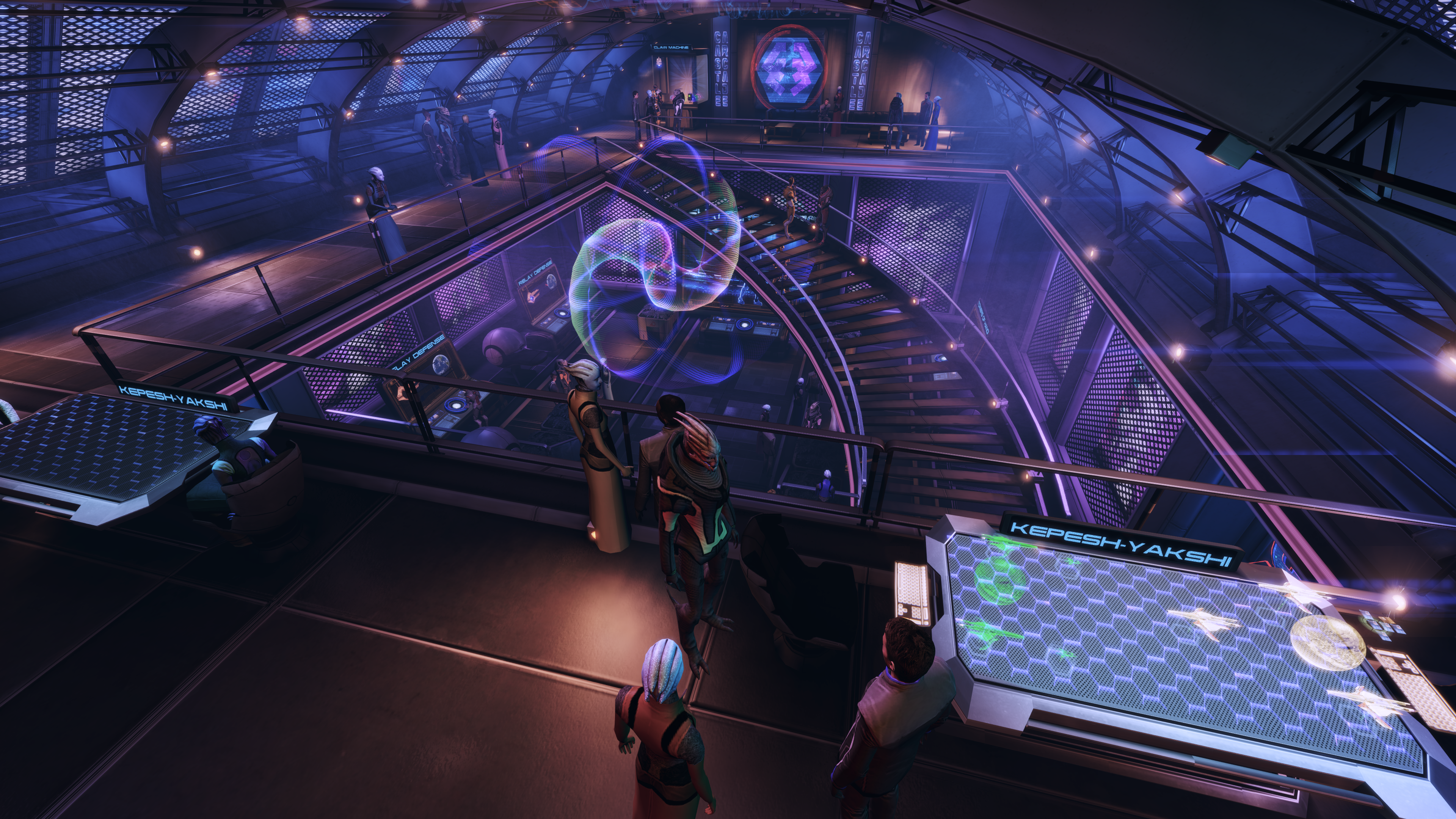
It is a Game Art course I'm on so I'd best talk about the importance of visuals in level design as well. The graphical fidelity is obviously important, but there is more to it than that. REFERENCE IS EVERYTHING. You want your map to be relatively believable. Even in a fantasy setting there has to be something to ground it to reality. For example, even in games like Mass Effect, the environments and levels that they create feel relatively believable. whether it be the Normandy or an alien planet, they feel like liveable spaces.

A big thing that you should think about is the uniqueness of your map. Like I explained before, it's all about entertainment. How much is the player enjoying your level? If they've played something that looked exactly like it before, they won't be nearly as interested as they would be if you're giving them a unique experience. This can be achieved through gameplay, but more often than not it's achieved through the visual aesthetic of your level. This can be done with a hero asset, colour scheme or a particular style you've chosen to use your textures or models. Looking back to Mass Effect, you can see it in the Citadel DLC. The Silversun Strip is the new area introduced on the Citadel and the colour scheme is very vivid and bright with lots of blues and purples with neon signs and bright lights. Each area within Mass Effect has a different colour scheme and visual motifs and it helps keep the game fresh and interesting for the player.


Atmosphere is something else you need to take into account when thinking about the visual feel of your level. Again, much like with the Citadel DLC, the colour plays a big part, but lighting is probably the most important thing involved in creating the atmosphere. The lighting and colours in the Silversun Strip and the asset placements and people that populate the area all create this bustling, flashy feel; wealth and excitement.


This is where your reference will come into play as well. Getting pictures of areas with the lighting conditions you want will be invaluable to you when creating your lighting. Especially in exterior levels. Depending on the time of day and the time of year, the lighting conditions will be different so your level should reflect that. It all adds up to creating that sense of realism. Atmosphere can make or break your entire level;  you're aiming for suspense but your level doesn't feel tense or scary, you need to go back and readjust.

Another important thing involved in level design is story. I touched on this when I wrote about environment design in my first year blogs, and reviewing it has made me think about Dead Space in terms of level design. Like I previous explained, within your level you can tell an entire story without using any characters. So many different games do this, from Left 4 Dead to Dead Island to Dead Space (a lot of "deads" there). It helps to create a more realistic, lived in environment and that will give the player, hopefully some extra entertainment  and something more to explore. As well as this, though, your level must convey they actual objective so the player can navigate their way through the map and they understand their purpose there.


This barely covers the complicated formula that is Level Design. There is so much more to talk about and people spend entire careers trying to perfect their abilities in this particular area.

I've been studying Game Art for a year and a bit. I'm no expert, so forgive me.

If anyone reads this and has and tips or interesting theories and workflows, please message me/email me or let me know. I'd be interested to hear any tips you guys have. 

References used:

Saturday, 23 November 2013

Visual Composition: Between a Rock-Tree-Bush and a Hard Place

Ever looked at a painting and though "Wow, that looks awesome!" but you don't quite know why?

Composition.

Ever looked at a piece of artwork and thought "eh, something's not quite right here"?

Composition.

Ever played a video game and you walk through a door and look out over a vast landscape and were blown away?

Composition.

I think I've hammered my point home enough here. Composition is one of, if not the, most important thing involved in any visual practice. Explaining what it is is a little complex, but as Studio Codex defined it, composition is "how artists work with their judgement, make associations, and determine how to direct the observer’s eye".

There are so many different elements that you have to take into account when you think about composition. Usually there are 8 areas that you need to look at when it comes to painting:

  • Unity - how well it all fits together
  • Balance - Obviously, this is how your image is balanced. Symmetrical paintings seem to be more calm, where as asymmetry seems to be more lively.
  •  Movement -This, again, is exactly as it sounds, adding movement by arranging the elements of your images; you lead the viewer through your painting.
  •  Rhythm  - This is repeating colours, shapes etc. and how you arrange them to lead your viewer through the painting again. 
  • Focus  - Of course the part of your image you are aiming to emphasize. This can be done with contrasting colours, colour saturation and also arranging shapes to lead the viewer to your point of focus.
  • Contrast - The contrast between light and dark and colours in the painting. The tone can help lead your viewer around your image as well.
  • Pattern - All about your the pattern, shapes and lines within your composition
  • Proportion - All about the big and small, basically.

All of these different elements must be used together to create a great image and this isn't even taking into account all the other things that are important when it comes to visual acuity, like colour theory etc.
There are loads of other areas included in composition; arabesques and rule of thirds and lots quinstances and all that. They all help to make the image pleasing to the eye. You can see it in many images and there are some fantastic sites that break down these images. The best one I've come across is the Canon of Design. It breaks down paintings done by masters and even shots from TV shows  and explains how they've been constructed. Reading through it means that I can see how these images have been created and apply the techniques and rules to my own work.

The Rule of Thirds Killed Design And Left It For Dead Part 2 -
Locked into the Grid - Found here.
The Rule of Thirds Killed Design And Left It For Dead Part 2 -
Locked into the Grid - Found here.
Well, that's all about art and paintings but within a video game, it's a little different. Rather than painting a picture, the art work you create is a 3D space that will be inhabited by the player. The core ideas of composition are still the same, but there is a little more to think about.


When making a level you need to make the whole environment seem visually pleasing to the player and also lead through the level. This is where composition comes into play. If we take a look at Mass Effect 3, there are many compositional shots that also serve a purpose within the actual game itself, almost 4th dimensional. 
Screenshot taken from here.
This first image is of the Asari Temple on Thessia. You can see here there are a lot of compositional elements involved. The symmetry creates a serene feel, while the actual architecture within the temple all points you towards the central statue, the focus of the scene and also where the player should ultimately go to. The colour is light, contrasting the darker tones surrounding it. Triangular composition, known as an enclosure is also present here. Arranging shapes or elements into simple geometric shapes is usually most pleasing to the eyes, so the architecture and the statue form a triangle in the centre of the scene hence the "Rock, Tree, Bush Effect" is arranging an enclosure comprised of a rock, tree and bush to create a triangle, adding interest and variation. It's all used to lead the player to the focal point, but is also aesthetically pleasing to the eye.

Screenshot taken from here.
This image is also from Mass Effect. The construction of it is very similar, triangular composition, architecture pointing towards the focal point. However, in this image the focal point is actually the enemy and the red used helps to emphasize this point and show the danger.

Ultimately, composition is used in bloody everything but it's crazy complicated. There are so many different things to take into account and so many different techniques, from the rule of thirds to the inclusion of arabesques to the arrangement of shapes, enclosures and the relationships between then. Ergh, there's a lot.
Howeer, construction of images is important. It's also important to use within video games within a 3D space; it helps you lead the player around the level, draw their attention to focal points and also create a pleasing aesthetic. 

Basically, composition is awesome. 

-Hannah

Friday, 22 November 2013

Planning and Concepting: For Real, The Most Important Part...

NEVER UNDERESTIMATE THE PLANNING AND CONCEPTING STAGE.
Seriously. The whole project will crumble, you'll lose all your money, you'll have to live on the street and you will die.

Okay so that's a minor exaggeration, but there are a lot of reasons why both of these stages are important in the industry. From a creative standpoint, planning and concepting allows you to explore lots of ideas and get the best outcome because you've refined every part of your project. From a business standpoint, planning and concepting saves you a whole lot of money. It's  cheaper to get a guy to draw 20 variations of a person than it is to have a guy model and texture one person and then figure out it looks terrible and have to redo it. TIME IS MONEY PEOPLE.

There are lots of different areas of planning involved in Games Development. When you take a look at Wikipedia you can see the basic areas of pre-production are the high concept, pitch, concept, design document, prototype; all these are majorly important.

However, we are focusing specifically on planning and concepting, and they are what sets the visual style and aesthetic from the beginning. This gives you a guide to stick to for the rest of the development process. This is essential for keeping your game looking like a cohesive piece of work rather than a bunch of assets made by different people in different styles. A way to do this is through an Art Style Guide, which will contain information on the style which would be researched, your characters, texture details, interiors, exteriors etc. This should be followed buy everyone on the team for a cohesive feel to the style of the game. Some of the concept art that I love that has a very definitive style is from Matt Rhodes, who has been working on Dragon Age Inquisition.


One game that I think, in terms of its aesthetic, is spot on when it comes to this is the Fable franchise and, in particular, Fable 3. Interesting choice, I know, considering the game was less than stellar. Something people don't necessarily know about me is that I adore collecting game guides, particularly the specials editions. One of the guides I own is Fable 3 and in the back it has so much concept art that when I first saw it I nearly cried with happiness; it has character designs, environment designs, meshes, models and information about each concepts. It's a game artists' dream, seriously. This means that... well... citing a source for this blog will be a little difficult but I'll link to somewhere you can buy it. Pick it up on Amazon.

Anyway, all of their concepts look as though they are part of a single world with a particular style and when you play the game you can see it carry over so well.  Say what you want about this game, it's style is fantastic and cohesive. Each of their designs relates to another one as well, to make sure that they all fit together. For example, the description of the Auroran City says that "with the continent - we were aiming for a completely different feel to that of the familiar Albion" [1] but they also mention "the visual style still retains Fable elements, the swirl motifs being familiar"[1]. They also explain about the stonework textures having a "similar saturation, but with a different texture feel, endeavouring not to be too contrasting or jarring"[1].  When you look at Aurora you can see it has an entirely different atmosphere to Albion but it's isn't like you're in a different game with a different style. That's why concepting is important.

Fable III - Aurora Concept


Fable III - Aurora Concept


Fable III Screenshot - Aurora 

Fable III Screenshot - Aurora
Fable III Screenshots - Aurora

Applying this to my own work is difficult for me to do because it requires some SERIOUSLY good work ethic and the ability to plan and plan well. This is harder than it sounds. My work ethic is... lacking. My whole school life I'd been writing essays the day before hand-in, no problems. Game Art is not something that can be treated the same way.

Improving my work ethic is the biggest problem I've encountered on this course and I'm slowly building it up and getting better. There is nothing more satisfying that seeing all your work come together after you've gone through all the hard work to achieve the end result; it gives a buzz that I'm starting to crave a little more.

http://www.slideshare.net/Kelvis2000/game-development-preproduction - So unbelievably interesting to read through. 


[1] Fable III Limited Edition Strategy Guide pg 416

Saturday, 2 November 2013

Second Year Starts: How Did I Get Here?

Well... how did my first year go?

That's a very good question.

How will my second year go?

An even better question.

You're always taught to look back on what you've done. Whether it's at school, at university or at a job, you should always be looking back at mistakes, at victories, at everything; it's how you learn. So I suppose it's probably what I should do with my first year of Game Art.

In all honesty, my first year of Game Art was... okay. It wasn't terrible, but it wasn't great; average is the word I would use. I did my tasks, I completed my projects, I did presentations and that was that; and that's the problem. It was so average.

In the Games Industry, individuality is everything. You need to be able to stand out from the crowd to get a job. Who do you think a company is going to take on after a portfolio review? The girl who has some run-of-the-mill university projects or the girl who has spent time and effort on interesting side projects as well as having exciting new takes on her university-set work.

It's a no brainer.

Anyway, I'm getting ahead of myself.

First of all, it's probably a good idea to look at what went right in my first year. Let's take a look.

First of all: LIFE DRAWING
Easily my favourite part of the year. Life drawing is one of the most calming, yet useful parts of this course. Taking some time out to examine anatomy in detail and work on shading and tone variations while gathering some great images and poses for reference later. I always put in 110% effort in life drawing. It's all about expression as well as accuracy so it didn't always have to be completely perfect.


I just really like life drawing.


Secondly: 3D PROJECTS
 When I came onto the course from Sixth Form, I had absolutely ZERO experience with any kind of 3D software. I'd come from a completely art based background and had no idea how I was going to get to grips with the 3D side of the course.

Turned out I really liked it.


First attempt modelling and texturing. What a joke...


Remodelled and textured in 5 hours in the second term. Looks INFINITELY BETTER.
First year introduced me to the core principles of 3D modelling and texturing and I think I picked up on it fairly quickly.

Picking a favourite 3D project from the first year is easy; the transit van project. It was so much fun. Previously we'd really only made things that were very straight, like buildings, bins etc. However, the transit van was a nice departure from this with a little more skill required to make a good model. It was a lot of fun and a real lesson in fixing n-gons. While the model took a while to make, I'm fairly confident that actually remaking it wouldn't take all that long; a day if that.


There were many other things in the first year that I enjoyed as well. The presentations we did for critical studies and the journalism that we looked in to really helped me come out of my shell and it turned out that I really enjoyed presenting, something that I would rather have killed myself than do a year or so ago.

If you want to read my Dragon Age: Origins review that I did for Critical Studies last year, check it out here.
However, not everything was a total success. My biggest problem in first year can be summed up in two words.
TIME.
MANAGEMENT.
It's something I've always struggled with. In school I did essay based subjects which I could always bash out in a night and hand them in the next day to get an A. Game Art is not like this and never will be. It's hard bloody work. It requires dedication and time, something that I really underestimated at first and it cost me.
So, after all this, what can I take away from it?
WORK HARDER. Seriously. That's my main goal this year. Just keep working and keep working hard. Practice makes perfect, as they say, so the more I do, the better I'll get. Right?

Well, I'll let you know how it goes...